Messages that make it big
Sometimes a flipchart is not enough. Who would have thought that this sentence would one day come from me and I would actually mean it … but it’s true. Sometimes you want to carry a message into the world beyond the seminar room in the truest sense of the word. And the flipchart is not perfectly suited for this. But there are alternatives.
How these can look like, what you should take into account when designing, which material you can use and how you can achieve a good result without a printshop, we want to take a look at in this #visdo. For this I will go into content, form and material:
The content
Before we look at how the message can be shaped, first a few words about the content. It is important to use short phrases and understandable words (no complicated technical vocabulary). If you are creative and can think of a wording that is also humorous, meaningful, animating or rhymes, all the better.
When in doubt, it’s always worth thinking up several text options and then discussing them with a few people to see which one will be most popular.
The form
Many things are a matter of taste. But one thing is an absolute must: legibility. Your text must be clear and easy to read (even from a distance). That means too small, sloppy or illegible fonts are taboo. How do you achieve legibility and appeal even in large format?
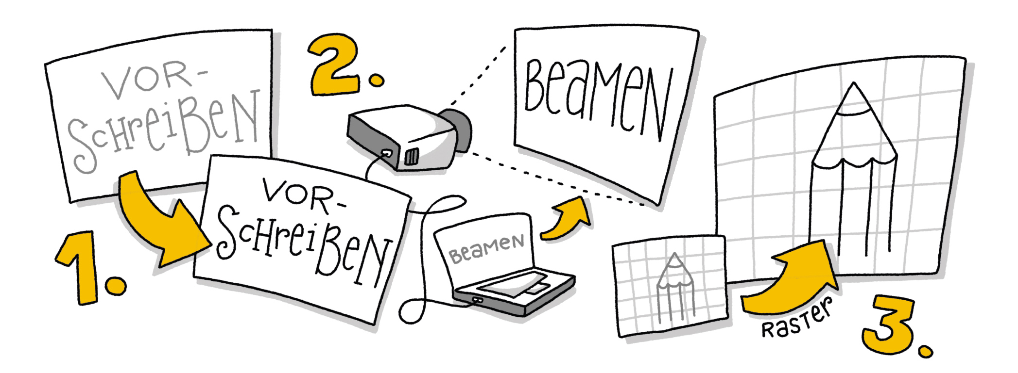
- Draft You can make a sketch with a pencil before you start the final implementation. If you follow the lines with a thick black pencil, you probably won’t even have to erase the pencil lines at the end, as they will be well hidden.
- Project For particularly large posters, a digital template can also be created on the computer and then transferred to the poster by beamer. This is also a good idea if you want to design several identical posters.
- Grid The trick that artists have used for centuries to transfer a small sketch to a large format without digital aids is rasterizing. To do this, you draw a grid over the original, transfer the same number of columns and rows onto the larger sheet and can use the grid to orientate yourself as to what belongs where. It may sound a bit complicated, but in practice it is very simple and useful.
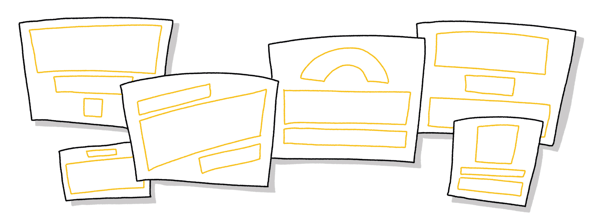
Another tip: When placing the text, also pay attention to the column alignment. Centered text often works best for posters. In any case, it is important that everything fits together well and that the words are not compressed at the end of a line or you even have to draw an arc at the edge. I recommend you to draw placeholder boxes in which you can insert your words.
It makes sense to write important words bigger and maybe highlight them in color. This means that one or two words are designed with a signal color (red for example) and maybe written in bigger, bolder letters.
But if you colour too many words and vary the size, you achieve the exact opposite – instead of highlighting something and making the text more readable, you can no longer see what is important and reading becomes tedious. Less is therefore often more.
The material
Now that we have an idea of what and how we want to write, the only question is which material is best used for this. You probably won’t get far with flipchart paper, since it is too thin and would tear quickly. Therefore I suggest the following alternatives:
- Cardboard and flipchart pens The cardboard can either be thick so it‘ s stable enough or you can glue a thin cardboard onto a solid surface, such as wood. To make this variant rainproof, you can use either transparent spray paint or a transparent adhesive foil.
- Lightweight boards and waterproof markers This is probably the most practical option (although not the most environmentally friendly). The plates are solid and the waterproof markers do not smudge with the first raindrop.
- Fabric and textile markers These offer the advantage that you can work on very large formats and the result is still easy to transport (I can easily fold a 3 meter fabric panel and put it in a backpack – a light fabric or wooden panel of this dimension can sometimes be a logistical problem…)
- Wood panels and paint This is a very robust version. However, drawing with brush and paint is not so easy and wooden boards are rather heavy and bulky to transport.
Whatever you decide to do: may your messages make the world a better place and your design help to reach as many people as possible.
Author: Lana Lauren
Translation: Astrid Donaubauer
Read original article in German


Dieses Werk ist lizenziert unter einer Creative Commons Namensnennung-NichtKommerziell-Weitergabe unter gleichen Bedingungen unter gleichen Bedingungen 3.0 Österreich Lizenz.
Volltext der Lizenz